瑞典連鎖藥局Vårdapoteket請設計公司Stockho
以下轉載自: designboom
first image
pattern made using the colorful body organs
stockholm design lab have created a new identity scheme for the pharmacy chain vårdapoteket.
---
following text from SDL
vårdapoteket is a swedish pharmacy chain with 24 pharmacies placed in care related locations.
to distinguish and contrast themselves from the often very clinical and barren environments
that hospitals make out, SDL developed a new identity inspired by the human body.
with a strong and positive color palette and a pattern based on the internal organs of the human body,
a strong base for their new identity was created. this graphic language is now used in all types of applications;
from in-store wallpaper to all sorts of printed material, such as stationery, retail and point-of-sale materials.
we provided vårdapoteket with a simple and playful toolbox that creates an inspiring identity and much
appreciated retail environment.

graphic toolbox

all of the body organs used in the identity scheme

brochures

brochure detail

back of the brochures

envelopes

these carrier bags highlight how the organs are combined with blocks of solid color

membership card

business cards
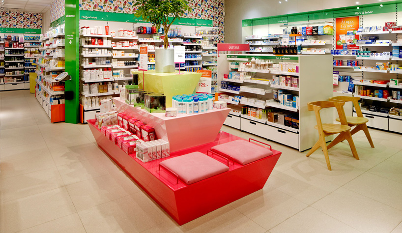 in-store applications...


pattern made using the colorful body organs
stockholm design lab have created a new identity scheme for the pharmacy chain vårdapoteket.
---
following text from SDL
vårdapoteket is a swedish pharmacy chain with 24 pharmacies placed in care related locations.
to distinguish and contrast themselves from the often very clinical and barren environments
that hospitals make out, SDL developed a new identity inspired by the human body.
with a strong and positive color palette and a pattern based on the internal organs of the human body,
a strong base for their new identity was created. this graphic language is now used in all types of applications;
from in-store wallpaper to all sorts of printed material, such as stationery, retail and point-of-sale materials.
we provided vårdapoteket with a simple and playful toolbox that creates an inspiring identity and much
appreciated retail environment.
graphic toolbox
all of the body organs used in the identity scheme
brochures
brochure detail
back of the brochures
envelopes
these carrier bags highlight how the organs are combined with blocks of solid color
membership card
business cards
in-store applications...
---
learn how to create your own brand and promote your work...
learn how to create your own brand and promote your work...
design-aerobics 2012: SELF-PROMO course - now online!
january 17 - march 17, 2012
沒有留言:
張貼留言